class: inverse, left, bottom background-image: url("img/back1.jpg") background-size: cover # **Data Visualization in R** ---- ## **<br/> Introduction** ### PhD. St. Orlando Joaqui-Barandica ### 2021 --- class: inverse, middle, center background-color: #C0392B <br><br> .center[ <img style="border-radius: 50%;" src="img/avatar.png" width="160px" href="https://www.joaquibarandica.com" /> ### [PhD. Student. Orlando Joaqui-Barandica](https://www.joaquibarandica.com) <br/> ### Universidad del Valle ] <br> .center[ *PhD. Student in Engineering with emphasis in Engineering Industrial* *MSc. Applied Economics* *BSc. Statistic* <i class="fas fa-link fa-spin "></i> [www.joaquibarandica.com](https://www.joaquibarandica.com) ] --- .pull-left[ <br><br><br><br><br> <img src="img/gif1.gif" width="110%" /> ] <br><br> .pull-right[ .center[ # Orlando Joaqui-Barandica ### [www.joaquibarandica.com](https://www.joaquibarandica.com) `Statistician and Master in Applied Economics from Universidad del Valle. He is currently a Ph.D. student in Engineering with an emphasis in Industrial Engineering. Teaching and research experience in the area of Statistics, Econometrics and Quantitative Finance in different recognized universities in the region such as Universidad del Valle, Pontificia Universidad Javeriana de Cali and Universidad ICESI. Research lines: Applied Statistics, Applied Econometrics, Quantitative Finance, Asset-Liability Management.` ] ] --- class: center, middle # Motivación... 🥳 #DataViz --- name: menu background-image: url("img/back2.jpg") background-size: cover class: left, middle, inverse # Contenido ---- .pull-left[ ### <i class="fa fa-table" role="presentation" aria-label="table icon"></i> [Tables in R](#Tablas) ### <i class="fa fa-chart-pie" role="presentation" aria-label="chart-pie icon"></i> [Basic Graphs](#Basic) ### <i class="fa fa-chart-bar" role="presentation" aria-label="chart-bar icon"></i> [Good Graphs](#Good) ### <i class="fa fa-diagnoses" role="presentation" aria-label="diagnoses icon"></i> [Interactive Graphs](#Interactive) ] .pull-right[ ### <i class="fa fa-tachometer-alt" role="presentation" aria-label="tachometer-alt icon"></i> [Dashboard](#Dashboard) ### <i class="fa fa-link" role="presentation" aria-label="link icon"></i> [WebPage](#Webpage) ### <i class="fa fa-book-open" role="presentation" aria-label="book-open icon"></i> [Programa del curso](#Programa) ] --- .left-column[ # Data Viz in R-Studio ] .right-column[ ### De lo simple a lo complejo 😵 .center[ <img src="img/img3.png" width="65%" /> ] .right[ ---- *No siempre lo complejo es lo mejor* ] ] --- name: Tablas class: inverse, center, middle # <i class="fa fa-table" role="presentation" aria-label="table icon"></i> # Tables in R ---- .right[ .bottom[ #### [<i class="fa fa-bell" role="presentation" aria-label="bell icon"></i>](#menu) ] ] --- # <i class="fa fa-table" role="presentation" aria-label="table icon"></i> Tables <table> <thead> <tr> <th style="text-align:left;"> Divipola </th> <th style="text-align:left;"> Departamento </th> <th style="text-align:left;"> Municipio </th> <th style="text-align:right;"> Edad </th> <th style="text-align:left;"> Sexo </th> <th style="text-align:left;"> Fecha </th> </tr> </thead> <tbody> <tr> <td style="text-align:left;"> 05 </td> <td style="text-align:left;"> ANTIOQUIA </td> <td style="text-align:left;"> ITUANGO </td> <td style="text-align:right;"> 58 </td> <td style="text-align:left;"> M </td> <td style="text-align:left;"> 2020-07-02 </td> </tr> <tr> <td style="text-align:left;"> 05 </td> <td style="text-align:left;"> ANTIOQUIA </td> <td style="text-align:left;"> MEDELLIN </td> <td style="text-align:right;"> 45 </td> <td style="text-align:left;"> M </td> <td style="text-align:left;"> 2020-12-15 </td> </tr> <tr> <td style="text-align:left;"> 05 </td> <td style="text-align:left;"> ANTIOQUIA </td> <td style="text-align:left;"> MEDELLIN </td> <td style="text-align:right;"> 50 </td> <td style="text-align:left;"> F </td> <td style="text-align:left;"> 2021-04-21 </td> </tr> <tr> <td style="text-align:left;"> 05 </td> <td style="text-align:left;"> ANTIOQUIA </td> <td style="text-align:left;"> MEDELLIN </td> <td style="text-align:right;"> 26 </td> <td style="text-align:left;"> F </td> <td style="text-align:left;"> 2020-09-11 </td> </tr> <tr> <td style="text-align:left;"> 05 </td> <td style="text-align:left;"> ANTIOQUIA </td> <td style="text-align:left;"> SABANETA </td> <td style="text-align:right;"> 28 </td> <td style="text-align:left;"> M </td> <td style="text-align:left;"> 2021-04-03 </td> </tr> <tr> <td style="text-align:left;"> 05 </td> <td style="text-align:left;"> ANTIOQUIA </td> <td style="text-align:left;"> ITAGUI </td> <td style="text-align:right;"> 61 </td> <td style="text-align:left;"> M </td> <td style="text-align:left;"> 2021-03-31 </td> </tr> </tbody> </table> -- .pull-left[ `Datos de COVID-19` Los datos de `COVID-19` presentados tienen fecha de corte del 17 de Julio de 2020. Son descargados desde la página web [Datos abiertos Colombia](https://www.datos.gov.co) ] .pull-right[ ### Tabla básica > Esta tabla es estática puede servir para la presentación en informes tipo PDF. Es una tabla de corte sencillo desde su aspecto visual. ] --- # <i class="fa fa-table" role="presentation" aria-label="table icon"></i> Tables <div id="htmlwidget-593deb68558ce1ed2474" style="width:100%;height:auto;" class="datatables html-widget"></div> <script type="application/json" data-for="htmlwidget-593deb68558ce1ed2474">{"x":{"filter":"none","data":[["1","2","3","4","5","6","7","8","9","10","11","12","13","14","15"],["11","05","76","05","05","05","11","11","11","11","41","41","41","11","17"],["BOGOTA","ANTIOQUIA","VALLE","ANTIOQUIA","ANTIOQUIA","ANTIOQUIA","BOGOTA","BOGOTA","BOGOTA","BOGOTA","HUILA","HUILA","HUILA","BOGOTA","CALDAS"],["BOGOTA","MEDELLIN","BUGA","MEDELLIN","ITAGUI","MEDELLIN","BOGOTA","BOGOTA","BOGOTA","BOGOTA","NEIVA","NEIVA","NEIVA","BOGOTA","MANIZALES"],[19,50,34,25,27,55,22,28,36,42,55,68,74,61,65],["F","F","M","M","F","M","F","F","F","F","F","F","F","F","M"],["2020-03-06","2020-03-09","2020-03-09","2020-03-11","2020-03-11","2020-03-11","2020-03-11","2020-03-11","2020-03-12","2020-03-12","2020-03-12","2020-03-12","2020-03-12","2020-03-13","2020-03-13"]],"container":"<table class=\"display\">\n <thead>\n <tr>\n <th> <\/th>\n <th>Divipola<\/th>\n <th>Departamento<\/th>\n <th>Municipio<\/th>\n <th>Edad<\/th>\n <th>Sexo<\/th>\n <th>Fecha<\/th>\n <\/tr>\n <\/thead>\n<\/table>","options":{"pageLength":5,"columnDefs":[{"className":"dt-right","targets":4},{"orderable":false,"targets":0}],"order":[],"autoWidth":false,"orderClasses":false,"lengthMenu":[5,10,25,50,100]}},"evals":[],"jsHooks":[]}</script> ### Tabla dinámica > Este tipo de tablas permiten una interacción con el usuario, en la cual puede ordenar datos, filtrar, paginar, etc. --- ### Este slide resume información de una Data de más de 4'000.000 de registros. 📚 *Tablas y Mapas trabajando juntos!!* <div id="htmlwidget-47b6a55c0d060b4cd5ca" style="width:1100px;height:200px;" class="leaflet html-widget"></div> <script type="application/json" data-for="htmlwidget-47b6a55c0d060b4cd5ca">{"x":{"options":{"crs":{"crsClass":"L.CRS.EPSG3857","code":null,"proj4def":null,"projectedBounds":null,"options":{}}},"calls":[{"method":"addSelect","args":["Departamento"]},{"method":"addTiles","args":["//{s}.tile.openstreetmap.org/{z}/{x}/{y}.png",null,null,{"minZoom":0,"maxZoom":18,"tileSize":256,"subdomains":"abc","errorTileUrl":"","tms":false,"noWrap":false,"zoomOffset":0,"zoomReverse":false,"opacity":1,"zIndex":1,"detectRetina":false,"attribution":"© <a href=\"http://openstreetmap.org\">OpenStreetMap<\/a> contributors, <a href=\"http://creativecommons.org/licenses/by-sa/2.0/\">CC-BY-SA<\/a>"}]},{"method":"addMarkers","args":[[6.702032125,10.677009534,4.316107698,8.079796863,5.891672889,5.280139978,0.798556195,2.396833887,9.53665993,8.358549754,4.771120716,5.397581542,2.570143029,11.476870077,10.24738355,3.345562732,1.571094987,8.09513751,4.455241567,5.240757239,6.693633184,9.064941448,4.03477252,3.569858693,6.569577215,5.404064237,0.3673031,12.543115116,-1.54622768,2.727842865,1.924531973,0.64624561,4.713557125],[-75.504557037,-74.965219492,-74.181072702,-74.235148136,-72.627880544,-75.274983037,-73.959467561,-76.824232828,-73.517831544,-75.792008718,-74.431110916,-76.942811002,-75.584348363,-72.429510724,-74.26175733,-72.95645988,-77.87020496,-72.881882969,-75.689628528,-76.002444694,-73.486008938,-75.109817552,-75.255827095,-76.62850427,-70.967323937,-71.601880726,-75.514061833,-81.717623824,-71.502128578,-68.816612721,-72.128595691,-70.561405657,-69.41400011],null,null,null,{"interactive":true,"draggable":false,"keyboard":true,"title":"","alt":"","zIndexOffset":0,"opacity":1,"riseOnHover":false,"riseOffset":250},["692062","110941","1371462","30474","99015","95730","21474","48020","84327","93528","246502","15475","80852","40606","25215","81254","83947","82429","52489","82293","212380","55191","100111","366121","12051","32700","14642","6598","6512","2175","4900","1699","2745"],null,null,null,["692062","110941","1371462","30474","99015","95730","21474","48020","84327","93528","246502","15475","80852","40606","25215","81254","83947","82429","52489","82293","212380","55191","100111","366121","12051","32700","14642","6598","6512","2175","4900","1699","2745"],{"interactive":false,"permanent":false,"direction":"auto","opacity":1,"offset":[0,0],"textsize":"10px","textOnly":false,"className":"","sticky":true},{"ctKey":["1","2","3","4","5","6","7","8","9","10","11","12","13","14","15","16","17","18","19","20","21","22","23","24","25","26","27","28","29","30","31","32","33"],"ctGroup":"Departamento"}]}],"limits":{"lat":[-1.54622768,12.543115116],"lng":[-81.717623824,-68.816612721]}},"evals":[],"jsHooks":[]}</script> <div id="htmlwidget-47cca65f573413bfe0f1" class="reactable html-widget" style="width:auto;height:auto;"></div> <script type="application/json" data-for="htmlwidget-47cca65f573413bfe0f1">{"x":{"tag":{"name":"Reactable","attribs":{"data":{"Divipola":["05","08","11","13","15","17","18","19","20","23","25","27","41","44","47","50","52","54","63","66","68","70","73","76","81","85","86","88","91","94","95","97","99"],"Departamento":["ANTIOQUIA","ATLÁNTICO","BOGOTÁ, D.C.","BOLÍVAR","BOYACÁ","CALDAS","CAQUETÁ","CAUCA","CESAR","CÓRDOBA","CUNDINAMARCA","CHOCÓ","HUILA","LA GUAJIRA","MAGDALENA","META","NARIÑO","NORTE DE SANTANDER","QUINDÍO","RISARALDA","SANTANDER","SUCRE","TOLIMA","VALLE DEL CAUCA","ARAUCA","CASANARE","PUTUMAYO","ARCHIPIÉLAGO DE SAN ANDRÉS, PROVIDENCIA Y SANTA CATALINA","AMAZONAS","GUAINÍA","GUAVIARE","VAUPÉS","VICHADA"],"Latitud":[6.702032125,10.677009534,4.316107698,8.079796863,5.891672889,5.280139978,0.798556195,2.396833887,9.53665993,8.358549754,4.771120716,5.397581542,2.570143029,11.476870077,10.24738355,3.345562732,1.571094987,8.09513751,4.455241567,5.240757239,6.693633184,9.064941448,4.03477252,3.569858693,6.569577215,5.404064237,0.3673031,12.543115116,-1.54622768,2.727842865,1.924531973,0.64624561,4.713557125],"Longitud":[-75.504557037,-74.965219492,-74.181072702,-74.235148136,-72.627880544,-75.274983037,-73.959467561,-76.824232828,-73.517831544,-75.792008718,-74.431110916,-76.942811002,-75.584348363,-72.429510724,-74.26175733,-72.95645988,-77.87020496,-72.881882969,-75.689628528,-76.002444694,-73.486008938,-75.109817552,-75.255827095,-76.62850427,-70.967323937,-71.601880726,-75.514061833,-81.717623824,-71.502128578,-68.816612721,-72.128595691,-70.561405657,-69.41400011],"Casos":[692062,110941,1371462,30474,99015,95730,21474,48020,84327,93528,246502,15475,80852,40606,25215,81254,83947,82429,52489,82293,212380,55191,100111,366121,12051,32700,14642,6598,6512,2175,4900,1699,2745]},"columns":[{"accessor":".selection","name":"","type":"NULL"},{"accessor":"Divipola","name":"Divipola","type":"character"},{"accessor":"Departamento","name":"Departamento","type":"character"},{"accessor":"Latitud","name":"Latitud","type":"numeric"},{"accessor":"Longitud","name":"Longitud","type":"numeric"},{"accessor":"Casos","name":"Casos","type":"numeric"}],"defaultPageSize":5,"paginationType":"numbers","showPageInfo":true,"minRows":5,"selection":"multiple","onClick":"select","rowStyle":{"cursor":"pointer"},"crosstalkKey":["1","2","3","4","5","6","7","8","9","10","11","12","13","14","15","16","17","18","19","20","21","22","23","24","25","26","27","28","29","30","31","32","33"],"crosstalkGroup":"Departamento","dataKey":"3503524d8b11f763399b223f98c92d9c","key":"3503524d8b11f763399b223f98c92d9c"},"children":[]},"class":"reactR_markup"},"evals":[],"jsHooks":[]}</script> --- name: Basic class: inverse, center, middle # <i class="fa fa-chart-pie" role="presentation" aria-label="chart-pie icon"></i> # Basic Graphs ---- .right[ .bottom[ #### [<i class="fa fa-bell" role="presentation" aria-label="bell icon"></i>](#menu) ] ] --- # <i class="fa fa-chart-pie" role="presentation" aria-label="chart-pie icon"></i> Basic Graphs .left-column[ Un gráfico básico aunque puede ser muy informativo de manera clara y concisa, la estética *(Ej: Color, Relleno (Fill), Labels, Size, Axes, ...)* 💅 hace que su lectura no sea agradable. ### Barplot ] .right-column[ 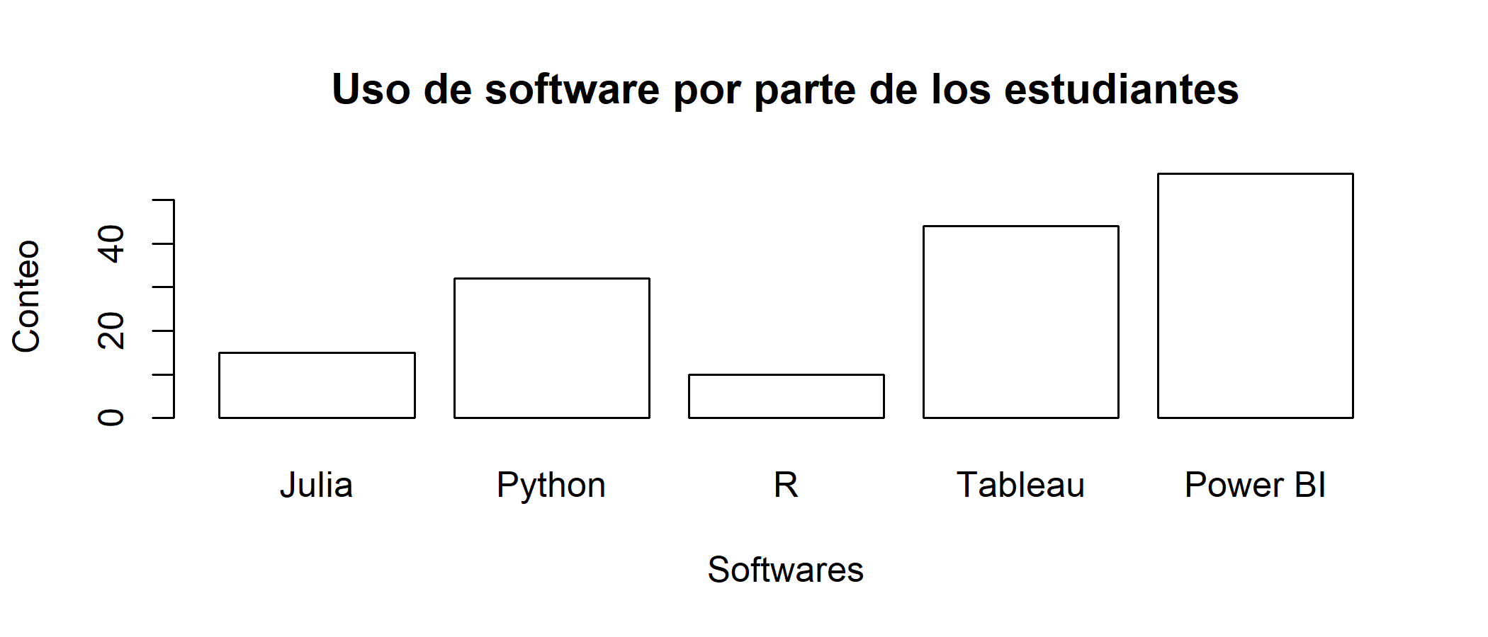<!-- --> ] --- # <i class="fa fa-chart-pie" role="presentation" aria-label="chart-pie icon"></i> Basic Graphs .left-column[ Un gráfico básico aunque puede ser muy informativo de manera clara y concisa, la estética *(Ej: Color, Relleno (Fill), Labels, Size, Axes, ...)* 💅 hace que su lectura no sea agradable. ### Barplot ] .right-column[ 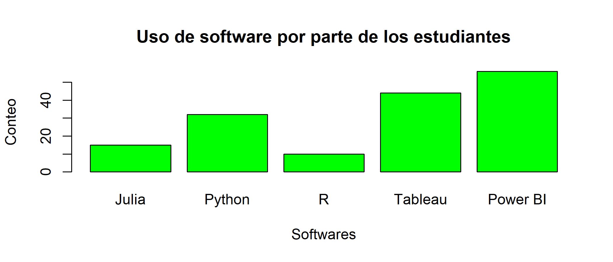<!-- --> .footnote[ ### 👀 Ojo! > No siempre la solución es el color.. ] ] --- background-image: url(img/monalisa1.jpg) background-size: cover class: inverse, center, middle # Entonces... ¿Qué es la estética? --- # Estética .left-column[ ## Dícese de .... <i class="fa fa-glasses" role="presentation" aria-label="glasses icon"></i>  ] .right-column[ La estética (del griego αἰσθητική [aisthetikê], ‘sensación’, ‘percepción’, y este de[aísthesis], ‘sensación’, ‘sensibilidad’, e -ικά [-icá], ‘relativo a’) es la rama de la filosofía que estudia la esencia y la percepción de la belleza y el arte. Algunos autores definen la estética de manera más amplia, como el estudio de las experiencias estéticas y los juicios estéticos en general, y no solo los relativos a la belleza. Cuando juzgamos algo como «bello», «feo», «sublime» o «elegante» (por dar algunos ejemplos), estamos haciendo juicios estéticos, que a su vez expresan experiencias estéticas. La estética es el dominio de la filosofía, estudiando el arte y cualidades como la belleza; asimismo es el estudio de estas experiencias y juicios que suceden día a día en las actividades que realizamos, produciendo sensaciones y emociones ya sean positivas o negativas en nuestra persona. La estética busca el por qué de algunas cuestiones, por ejemplo, por qué algún objeto, pintura o escultura no resulta atractivo para los espectadores; por lo tanto el arte lleva relación a la estética ya que busca generar sensaciones a través de una expresión............ 🥱🥱🥱🥱🥱🥱🥱🥱🥱🥱🥱 ---- .right[ Tomado de [Wikipedia](https://es.wikipedia.org/wiki/Est%C3%A9tica) ] ] --- class: center, middle .pull-left[ <img src="img/einstein.jpg" width="50%"/> ] .pull-right[ <img src="img/monalisa2.jpg" width="40%"/> ] ---- # Al final la "estética es relativa" ### Lo que para uno es *"bonito"* para otro no --- name: Good class: inverse, center, middle # <i class="fa fa-chart-bar" role="presentation" aria-label="chart-bar icon"></i> # Good Graphs ---- .right[ .bottom[ #### [<i class="fa fa-bell" role="presentation" aria-label="bell icon"></i>](#menu) ] ] --- # <i class="fa fa-chart-bar" role="presentation" aria-label="chart-bar icon"></i> Good Graphs .pull-left[ ### ggplot2 > Es una de las librerías de la colección de tidyverse. `ggplot2 es un sistema para crear gráficos de forma declarativa, basado en The Grammar of Graphics . Usted proporciona los datos, le dice a ggplot2 cómo asignar variables a la estética, qué geometrías gráficas usar y se encarga de los detalles.` .center[ <img src="https://soka.gitlab.io/blog/post/2019-04-25-r-ggplot2-scatterplot/images/ggplot_hex.jpg" width="150px"/> ] ] .pull-right[ 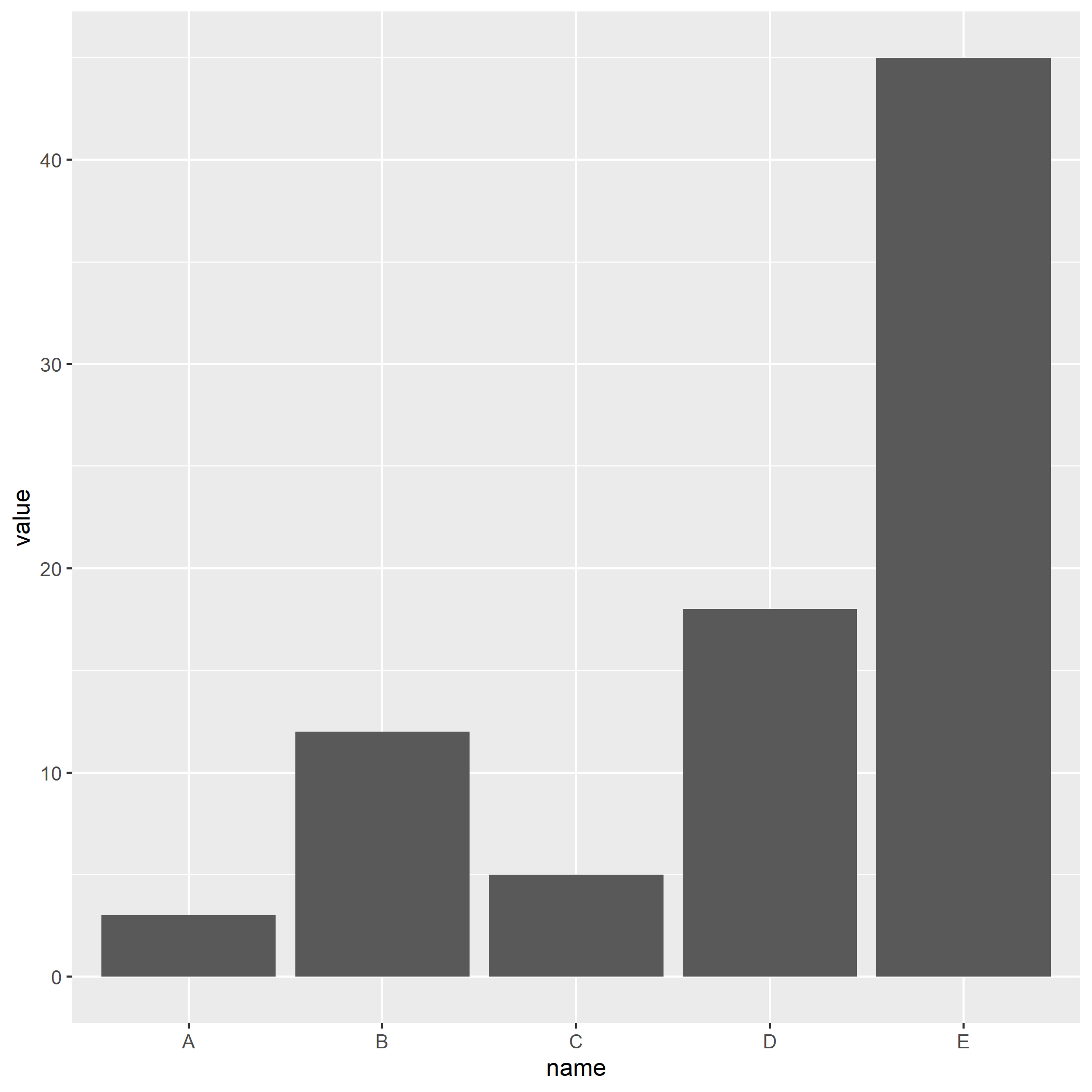<!-- --> ] --- # <i class="fa fa-chart-bar" role="presentation" aria-label="chart-bar icon"></i> Good Graphs <img src="1_Intro_files/figure-html/unnamed-chunk-9-1.png" width="100%" /> --- # <i class="fa fa-chart-bar" role="presentation" aria-label="chart-bar icon"></i> Good Graphs .pull-left[ 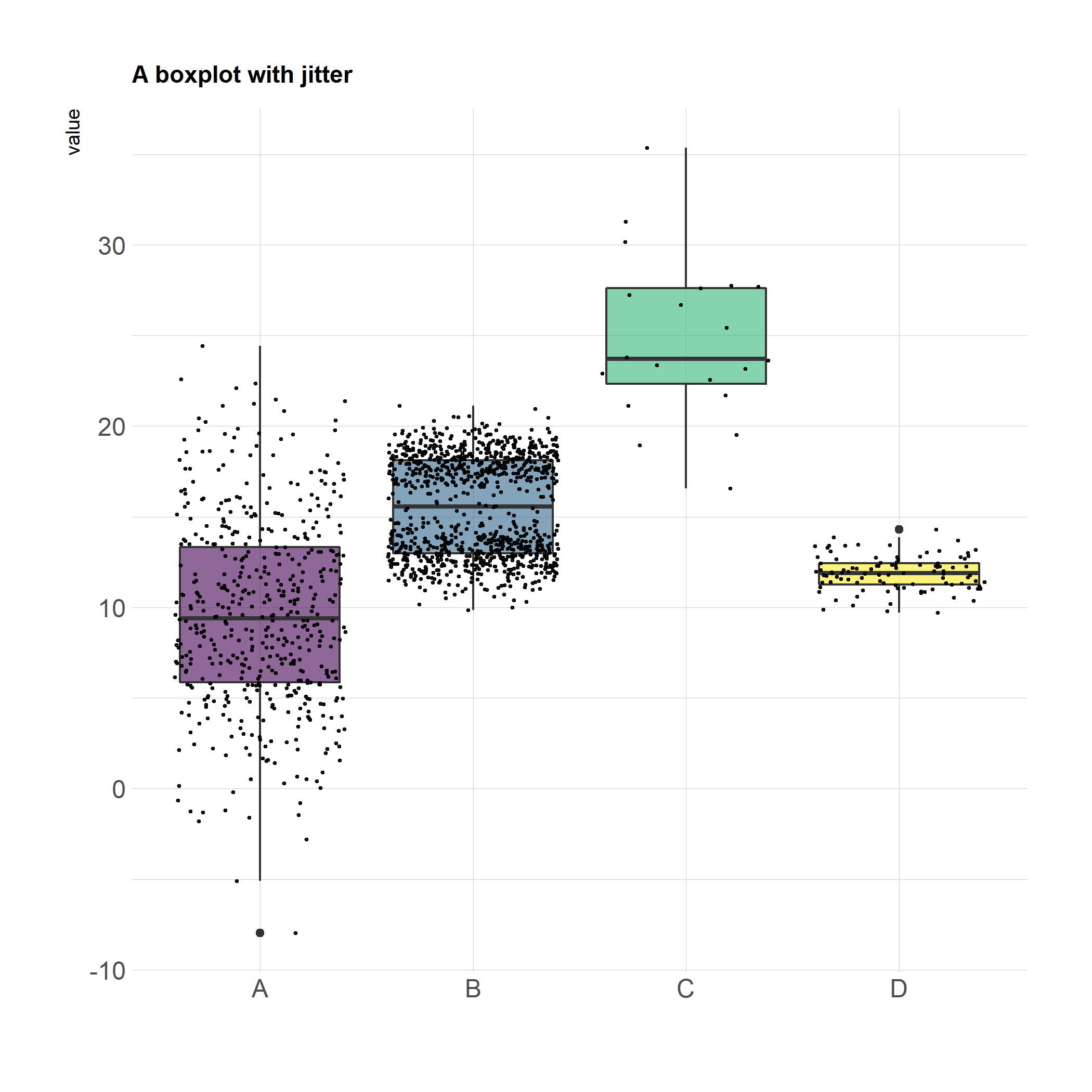<!-- --> ] .pull-right[ 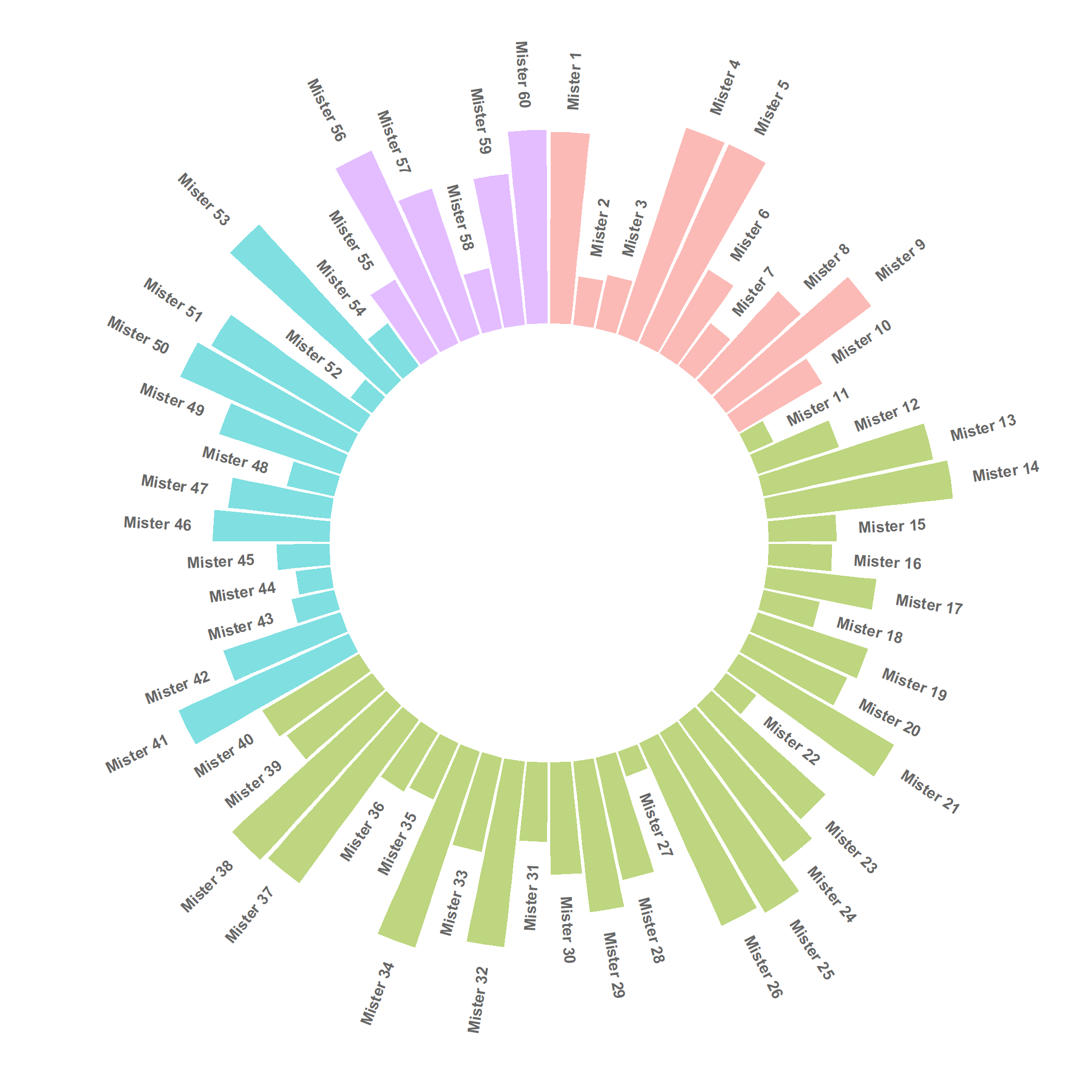<!-- --> ] --- # <i class="fa fa-chart-bar" role="presentation" aria-label="chart-bar icon"></i> Good Graphs ### Maps in R .left-column[ <img src="1_Intro_files/figure-html/unnamed-chunk-12-1.png" width="900%" /> # <i class="fa fa-arrow-alt-circle-right" role="presentation" aria-label="arrow-alt-circle-right icon"></i> <i class="fa fa-arrow-alt-circle-right" role="presentation" aria-label="arrow-alt-circle-right icon"></i> <i class="fa fa-arrow-alt-circle-right" role="presentation" aria-label="arrow-alt-circle-right icon"></i> ] .right-column[ 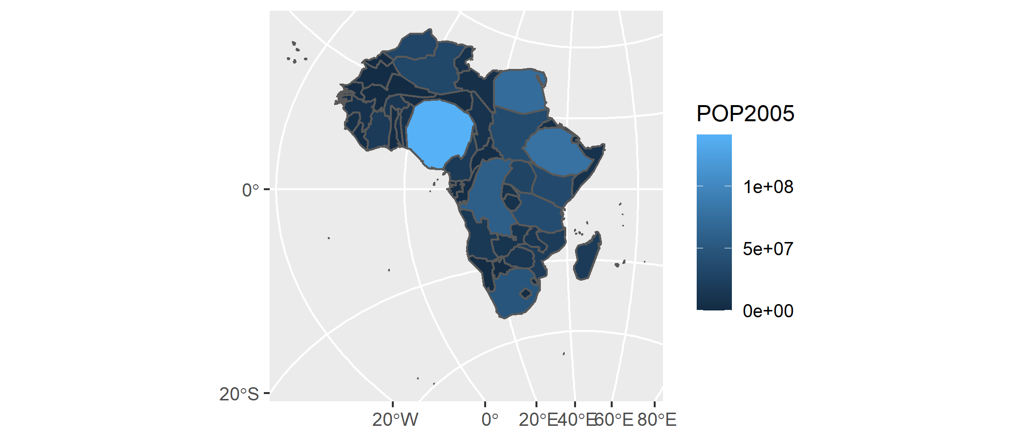<!-- --> ] --- # <i class="fa fa-comment-dots" role="presentation" aria-label="comment-dots icon"></i> Text Mining ### Wordcloud .left[ <div id="htmlwidget-3efc803bdfcf89e15252" style="width:100%;height:300px;" class="wordcloud2 html-widget"></div> <script type="application/json" data-for="htmlwidget-3efc803bdfcf89e15252">{"x":{"word":["oil","said","prices","opec","mln","the","last","bpd","dlrs","crude","market","reuter","saudi","will","one","barrel","kuwait","new","official","pct","price","barrels","government","production","sheikh","industry","meeting","minister","world","also","billion","futures","month","output","petroleum","quota","sources","accord","analysts","but","group","gulf","january","markets","report","today","december","demand","economic","economy","energy","help","international","may","nazer","nymex","posted","present","they","traders","158","ability","agreement","ali","april","arabia","budget","emergency","exchange","hold","imports","members","recent","riyals","says","sell","years","abdulaziz","agency","arab","ceiling","company","contract","daily","emirates","expected","expenditure","exports","growth","now","opecs","plans","qatar","quoted","research","reserve","reserves","states","study","united","way","week","west","year","150","according","added","among","asked","brings","buyers","can","change","corp","cut","day","development","effective","exploration","fall","february","fell","free","higher","increase","levels","meet","must","never","per","policy","power","problem","producing","protect","pumping","reduced","revenue","revenues","rise","saying","set","since","spa","strategic","texas","this","total","transaction","weak","yesterday","13nation","1985","198586","1986","1987","198788","address","agreed","alkhalifa","alqabas","alsabah","announced","appears","arabian","arabias","around","average","back","bank","bbl","boost","called","commitment","companies","compared","countrys","current","decrease","denied","dollars","domestic","due","efp","estimate","estimates","export","fixed","foreign","four","future","grade","guard","high","hisham","however","inc","indonesia","indonesias","intermediate","kingdoms","kuwaits","local","low","lower","lowered","made","main","march","mckiernan","measures","mizrahi","moves","much","named","next","officials","plant","position","president","pressure","producer","projected","published","real","refinery","reiterated","remain","rule","say","sector","several","sharp","ship","six","slightly","smaller","spokeswoman","state","sweet","texaco","three","trading","two","weeks","york","1518","198687","20s","285000","500","725","750","948000","activity","adhering","agriculture","along","apparently","appeared","approved","architect","areas","aspen","bankers","based","benchmark","benefits","canada","canadian","cash","changed","changes","circumstance","clearly","closed","coast","come","committee","commodity","consumption","countries","country","crossroads","crucial","cubic","currently","customers","deal","decembers","decline","deficit","deposits","deputy","diamond","differentials","difficulties","direction","discounted","dlr","early","ecuador","effect","embargo","embassy","entering","even","falling","feb","first","fiscal","fiscales","forced","fully","gcc","general","given","grades","halt","hit","hope","humanistic","impact","import","increased","increasing","instead","institute","interview","investment","jersey","june","keep","late","light","limit","limits","line","lost","louisiana","lowest","major","marketing","member","mid","million","ministers","mitigate","months","nearing","net","neutral","none","nuclear","organisation","organization","outlook","overseas","pact","pay","petroliferos","planned","port","positive","postings","predicted","press","pricing","private","probably","problems","pronounced","protected","public","put","quotes","raise","rate","reduction","referring","remarks","reports","return","review","risks","riyal","selfimposed","selling","share","shortfall","spot","steady","stick","strongly","studies","support","take","taken","techniques","throughput","trade","trust","trying","uncertainty","union","value","wam","wanted","weakness","winter","yacimientos","yanbu","zero","zone","100000","108","111","115","12217","1232","1381","13member","156","1600","1635","1650","1667","168","1685","1752","180000","200000","200foot","2226","24hour","2766","300","3749598","3750003","4133","534","5472","614","658","6745","678","718","738","able","abroad","accept","across","add","addressed","adherence","advantage","advisers","after","agricultural","aground","allocated","allocations","allow","almost","already","althani","although","alvite","amidst","analysis","analyst","annual","anything","apparent","aramco","argentine","arrangement","asia","asian","assesses","assign","assigned","associates","attract","available","averaging","aware","bahrain","bahrains","balance","baseless","basic","basis","because","beginning","bijan","bin","bit","bodys","briefly","broadened","brothers","buildings","burden","buy","buyer","calendar","cambridge","capacity","capozza","carrying","center","century","cera","certain","cftc","chairman","challenge","characterized","charging","cheap","cheating","chevron","chv","cited","citing","clever","close","closer","closes","coming","commission","communications","companys","completed","complex","condition","conditions","considered","construction","contacts","continuation","continue","continued","continues","contracted","contributed","control","cooperation","coordination","copany","corps","council","counter","coupled","covered","creek","critical","cts","currency","custom","cuts","cutting","cypriot","daniel","david","days","debtburdened","debut","decided","declared","declines","deemed","defence","delaware","delivered","delivering","departments","deregulate","deregulation","determination","devalue","device","differential","difficulty","dillard","director","discuss","discussing","distribution","distributions","divided","doha","dollar","drawbacks","drop","dropped","earlier","earnings","eastern","easy","ecuadors","editor","edmontonswann","education","eight","either","elaborate","elections","electricity","end","engineers","entitlements","environment","equally","estimated","european","exceed","exceeding","excess","excesses","excessive","exerted","exist","expanded","expansion","expartners","expectations","expects","explained","exporting","exxon","face","faced","faces","facilities","facing","failed","fallen","favours","fee","fernando","figure","figures","finance","firmer","floating","followed","for","forces","foremost","fourth","frank","full","fundamentals","gas","generally","geneva","get","globalization","glut","guaranteed","halting","harvard","heads","health","hedge","hedged","helped","hemisphere","highly","hills","hitting","hoped","housing","houston","immediately","implementation","improve","improvement","include","including","independent","indications","initiate","initiative","institutions","interbank","interest","investments","issue","jamaica","jan","juaymah","jubail","jump","just","khalifa","lack","largest","later","latest","launched","lead","leading","learn","least","lending","less","lesson","level","liberalised","lift","liftings","like","lines","liquidity","little","loan","lodged","longterm","ltd","lukman","lull","maintain","make","manager","manipulate","many","marathon","marathons","marker","mcfadden","means","mercantile","metrers","metres","mid1960s","mid1986","mideast","minus","mlotok","mob","mobil","momentum","money","monopolies","monthend","moussavarrahmani","movement","nation","natural","need","needs","negative","negotiate","neither","network","news","newspaper","nigerian","nine","nonoil","northern","notes","offset","onetwelfth","oneweek","open","opens","operations","opposite","optimism","optimistic","option","order","organiaation","our","outlining","outside","overproducing","part","parties","partly","party","past","paths","paul","paulsboro","payments","pegged","performance","period","pertains","pessimistic","philadelphia","physical","placed","plastics","platinum","point","policies","political","population","positions","postponed","pressures","previous","primarily","primary","principal","procedure","produce","produced","producers","product","products","program","projection","projects","prompted","proposed","proved","providing","provision","publish","purposes","quarter","quiet","quietly","quotas","rallied","ran","ranging","ras","rates","rationalise","readdress","reaffirmed","reasonable","recommending","recovering","recurrent","reference","refineries","refining","reflect","refloat","reform","reforms","regain","regard","regarding","region","regional","reiterate","relaxation","relieve","reluctant","remainder","remained","reported","request","resistance","resisting","resources","respectively","responsibilites","restored","restraint","restrictions","result","reuters","revealed","reviews","right","rilwanu","rising","river","rocks","rosemary","rumour","rushing","sales","salomon","santos","satisfied","saw","scheduled","scheme","seapride","season","secretary","security","seeing","seek","september","series","serve","services","session","sets","seven","severely","shamrock","sharply","shoulder","show","showed","shown","signed","signs","situation","sixmonth","slackens","slide","slump","social","sold","soon","sort","sour","south","southeast","spend","spill","spoke","spokesman","spotnext","spriggs","stabilise","stabilize","stable","start","statement","steel","steering","steps","stiff","storage","strong","subsequently","substitution","succeed","suffer","suffering","suhartos","sunday","sundays","supply","supporting","suppose","surrounding","swift","talks","tanker","tanurah","tapers","teach","telephone","terminals","test","there","third","thomas","though","thought","threemonth","tide","together","told","totalled","tower","trader","trades","traditional","traditionally","transacted","transmission","transport","trends","trusts","try","turmoil","twofold","uae","uncertain","unchanged","under","unions","unitholders","universitys","unlikely","unocal","unusually","urged","use","virtual","wants","water","wealth","wednesday","weekend","welcomed","when","whether","wishes","worldwide","xon","yergin","yesterdays"],"freq":[85,73,48,42,31,26,24,23,23,21,20,20,18,18,17,15,14,14,14,14,13,11,11,11,11,10,10,10,10,9,9,9,9,9,9,9,9,8,8,8,8,8,8,8,8,8,7,7,7,7,7,7,7,7,7,7,7,7,7,7,6,6,6,6,6,6,6,6,6,6,6,6,6,6,6,6,6,5,5,5,5,5,5,5,5,5,5,5,5,5,5,5,5,5,5,5,5,5,5,5,5,5,5,5,4,4,4,4,4,4,4,4,4,4,4,4,4,4,4,4,4,4,4,4,4,4,4,4,4,4,4,4,4,4,4,4,4,4,4,4,4,4,4,4,4,4,4,4,4,4,4,3,3,3,3,3,3,3,3,3,3,3,3,3,3,3,3,3,3,3,3,3,3,3,3,3,3,3,3,3,3,3,3,3,3,3,3,3,3,3,3,3,3,3,3,3,3,3,3,3,3,3,3,3,3,3,3,3,3,3,3,3,3,3,3,3,3,3,3,3,3,3,3,3,3,3,3,3,3,3,3,3,3,3,3,3,3,3,3,3,3,3,3,3,3,3,2,2,2,2,2,2,2,2,2,2,2,2,2,2,2,2,2,2,2,2,2,2,2,2,2,2,2,2,2,2,2,2,2,2,2,2,2,2,2,2,2,2,2,2,2,2,2,2,2,2,2,2,2,2,2,2,2,2,2,2,2,2,2,2,2,2,2,2,2,2,2,2,2,2,2,2,2,2,2,2,2,2,2,2,2,2,2,2,2,2,2,2,2,2,2,2,2,2,2,2,2,2,2,2,2,2,2,2,2,2,2,2,2,2,2,2,2,2,2,2,2,2,2,2,2,2,2,2,2,2,2,2,2,2,2,2,2,2,2,2,2,2,2,2,2,2,2,2,2,2,2,2,2,2,2,2,2,2,2,2,2,2,2,2,2,2,2,2,1,1,1,1,1,1,1,1,1,1,1,1,1,1,1,1,1,1,1,1,1,1,1,1,1,1,1,1,1,1,1,1,1,1,1,1,1,1,1,1,1,1,1,1,1,1,1,1,1,1,1,1,1,1,1,1,1,1,1,1,1,1,1,1,1,1,1,1,1,1,1,1,1,1,1,1,1,1,1,1,1,1,1,1,1,1,1,1,1,1,1,1,1,1,1,1,1,1,1,1,1,1,1,1,1,1,1,1,1,1,1,1,1,1,1,1,1,1,1,1,1,1,1,1,1,1,1,1,1,1,1,1,1,1,1,1,1,1,1,1,1,1,1,1,1,1,1,1,1,1,1,1,1,1,1,1,1,1,1,1,1,1,1,1,1,1,1,1,1,1,1,1,1,1,1,1,1,1,1,1,1,1,1,1,1,1,1,1,1,1,1,1,1,1,1,1,1,1,1,1,1,1,1,1,1,1,1,1,1,1,1,1,1,1,1,1,1,1,1,1,1,1,1,1,1,1,1,1,1,1,1,1,1,1,1,1,1,1,1,1,1,1,1,1,1,1,1,1,1,1,1,1,1,1,1,1,1,1,1,1,1,1,1,1,1,1,1,1,1,1,1,1,1,1,1,1,1,1,1,1,1,1,1,1,1,1,1,1,1,1,1,1,1,1,1,1,1,1,1,1,1,1,1,1,1,1,1,1,1,1,1,1,1,1,1,1,1,1,1,1,1,1,1,1,1,1,1,1,1,1,1,1,1,1,1,1,1,1,1,1,1,1,1,1,1,1,1,1,1,1,1,1,1,1,1,1,1,1,1,1,1,1,1,1,1,1,1,1,1,1,1,1,1,1,1,1,1,1,1,1,1,1,1,1,1,1,1,1,1,1,1,1,1,1,1,1,1,1,1,1,1,1,1,1,1,1,1,1,1,1,1,1,1,1,1,1,1,1,1,1,1,1,1,1,1,1,1,1,1,1,1,1,1,1,1,1,1,1,1,1,1,1,1,1,1,1,1,1,1,1,1,1,1,1,1,1,1,1,1,1,1,1,1,1,1,1,1,1,1,1,1,1,1,1,1,1,1,1,1,1,1,1,1,1,1,1,1,1,1,1,1,1,1,1,1,1,1,1,1,1,1,1,1,1,1,1,1,1,1,1,1,1,1,1,1,1,1,1,1,1,1,1,1,1,1,1,1,1,1,1,1,1,1,1,1,1,1,1,1,1,1,1,1,1,1,1,1,1,1,1,1,1,1,1,1,1,1,1,1,1,1,1,1,1,1,1,1,1,1,1,1,1,1,1,1,1,1,1,1,1,1,1,1,1,1,1,1,1,1,1,1,1,1,1,1,1,1],"fontFamily":"Segoe UI","fontWeight":"bold","color":"random-dark","minSize":0,"weightFactor":2.11764705882353,"backgroundColor":"white","gridSize":0,"minRotation":-0.785398163397448,"maxRotation":0.785398163397448,"shuffle":true,"rotateRatio":0.4,"shape":"circle","ellipticity":0.65,"figBase64":null,"hover":null},"evals":[],"jsHooks":{"render":[{"code":"function(el,x){\n console.log(123);\n if(!iii){\n window.location.reload();\n iii = False;\n\n }\n }","data":null}]}}</script> ] --- name: Interactive class: inverse, center, middle # <i class="fa fa-diagnoses" role="presentation" aria-label="diagnoses icon"></i> # Interactive Graphs ---- .right[ .bottom[ #### [<i class="fa fa-bell" role="presentation" aria-label="bell icon"></i>](#menu) ] ] --- # <i class="fa fa-diagnoses" role="presentation" aria-label="diagnoses icon"></i> Interactive Graphs .pull-left[ ### plotly > La biblioteca de gráficos R de Plotly crea gráficos interactivos con calidad de publicación (También proporciona librerías para Python). `Las bibliotecas de gráficos de código abierto de Plotly son de uso gratuito, funcionan sin conexión y no requieren ningún registro de cuenta. Plotly también tiene ofertas comerciales, como Dash Enterprise y Chart Studio Enterprise.` .center[ <img src="https://upload.wikimedia.org/wikipedia/commons/3/37/Plotly-logo-01-square.png" width="150px"/> ] ] .pull-right[ .center[ <iframe src="img/fig.3d.html" allowtransparency="true" height="450" width="1100" scrolling="yes" style="border: none;" data-external="1"></iframe> ] ] --- # <i class="fa fa-diagnoses" role="presentation" aria-label="diagnoses icon"></i> Interactive Graphs ### Maps .center[ <iframe src="img/fig.map.html" allowtransparency="true" height="450" width="1100" scrolling="yes" style="border: none;" data-external="1"></iframe> ] --- # <i class="fa fa-diagnoses" role="presentation" aria-label="diagnoses icon"></i> Interactive Graphs ### Maps (leaflet) <div id="htmlwidget-548227f8123dca3080ce" style="width:1100px;height:400px;" class="leaflet html-widget"></div> <script type="application/json" data-for="htmlwidget-548227f8123dca3080ce">{"x":{"options":{"crs":{"crsClass":"L.CRS.EPSG3857","code":null,"proj4def":null,"projectedBounds":null,"options":{}}},"calls":[{"method":"addTiles","args":["//{s}.tile.openstreetmap.org/{z}/{x}/{y}.png",null,null,{"minZoom":0,"maxZoom":18,"tileSize":256,"subdomains":"abc","errorTileUrl":"","tms":false,"noWrap":false,"zoomOffset":0,"zoomReverse":false,"opacity":1,"zIndex":1,"detectRetina":false,"attribution":"© <a href=\"http://openstreetmap.org\">OpenStreetMap<\/a> contributors, <a href=\"http://creativecommons.org/licenses/by-sa/2.0/\">CC-BY-SA<\/a>"}]},{"method":"addCircleMarkers","args":[[4.433,3.421],[-75.217,-76.52],10,null,null,{"interactive":true,"className":"","stroke":false,"color":"#03F","weight":5,"opacity":0.5,"fill":true,"fillColor":"#03F","fillOpacity":1},null,null,["Ibagué","Cali"],null,null,{"interactive":false,"permanent":false,"direction":"auto","opacity":1,"offset":[0,0],"textsize":"10px","textOnly":false,"className":"","sticky":true},null]}],"limits":{"lat":[3.421,4.433],"lng":[-76.52,-75.217]}},"evals":[],"jsHooks":[]}</script> --- # <i class="fa fa-diagnoses" role="presentation" aria-label="diagnoses icon"></i> Interactive Graphs ### Descriptive Graph (Bar) .center[ <iframe src="img/fig.bar.html" allowtransparency="true" height="450" width="1100" scrolling="yes" style="border: none;" data-external="1"></iframe> ] --- # <i class="fa fa-diagnoses" role="presentation" aria-label="diagnoses icon"></i> Interactive Graphs ### Descriptive Graph (Pie) .center[ <iframe src="img/fig_pie.html" allowtransparency="true" height="450" width="1100" scrolling="yes" seamless="seamless" frameBorder="0" data-external="1"> </iframe> ] --- # <i class="fa fa-diagnoses" role="presentation" aria-label="diagnoses icon"></i> Interactive Graphs ### Descriptive Graph (Line) .center[ <iframe src="img/fig.series.html" allowtransparency="true" height="450" width="1100" scrolling="yes" seamless="seamless" frameBorder="0" data-external="1"> </iframe> ] --- # <i class="fa fa-diagnoses" role="presentation" aria-label="diagnoses icon"></i> Interactive Graphs ### GGPLOT2 ➡️ plotly::ggplotly() .pull-left[ 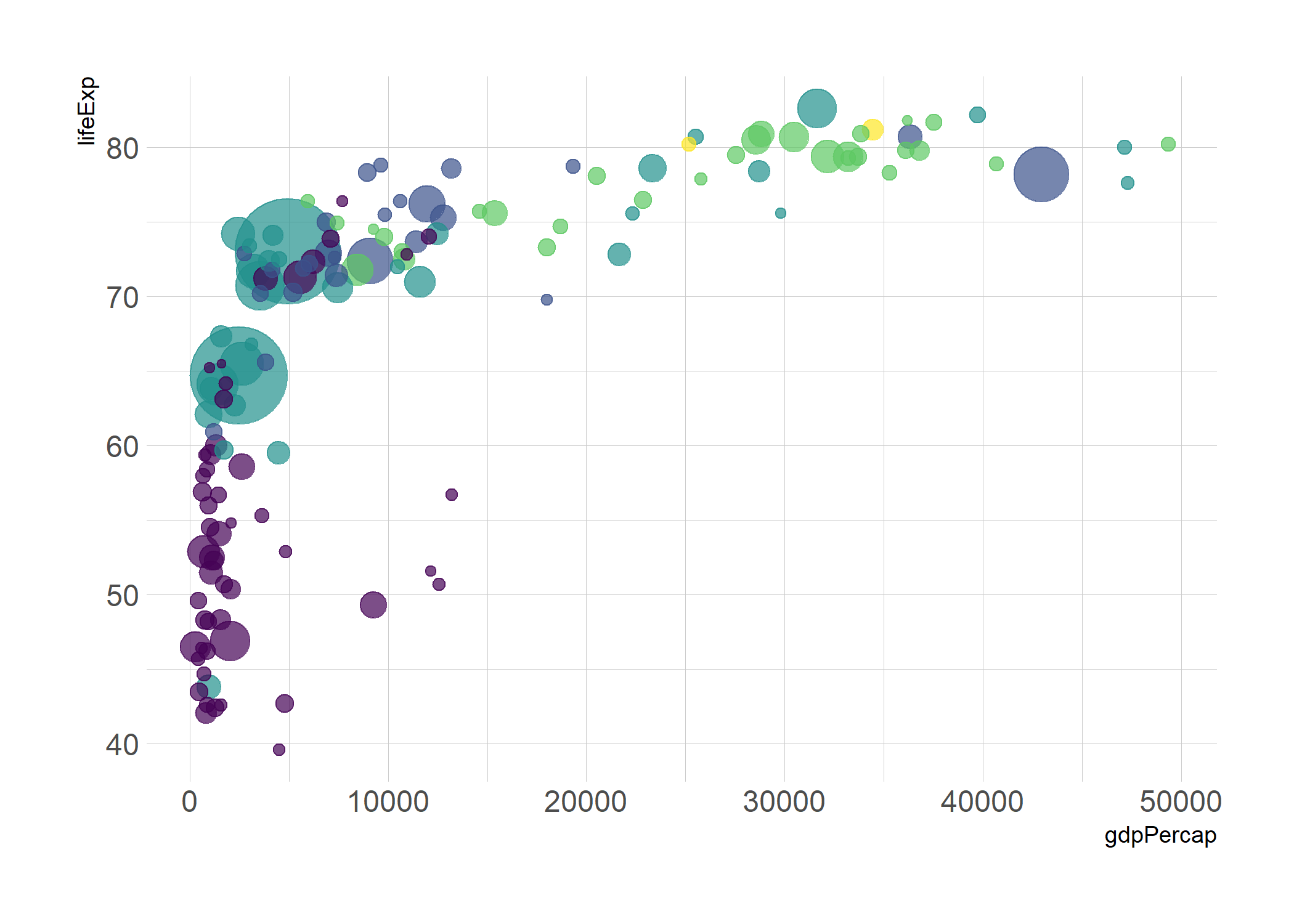<!-- --> ] .pull-right[ .center[ <iframe src="img/fig.bubble.html" allowtransparency="true" height="450" width="1100" scrolling="yes" seamless="seamless" frameBorder="0" data-external="1"> </iframe> ] ] --- # <i class="fa fa-diagnoses" role="presentation" aria-label="diagnoses icon"></i> Interactive Graphs .left-column[ ### Animated *gganimate()* Con las animaciones podemos generar impacto a nuestros graphs, mostrar evolución y mucho más. ] .right-column[ 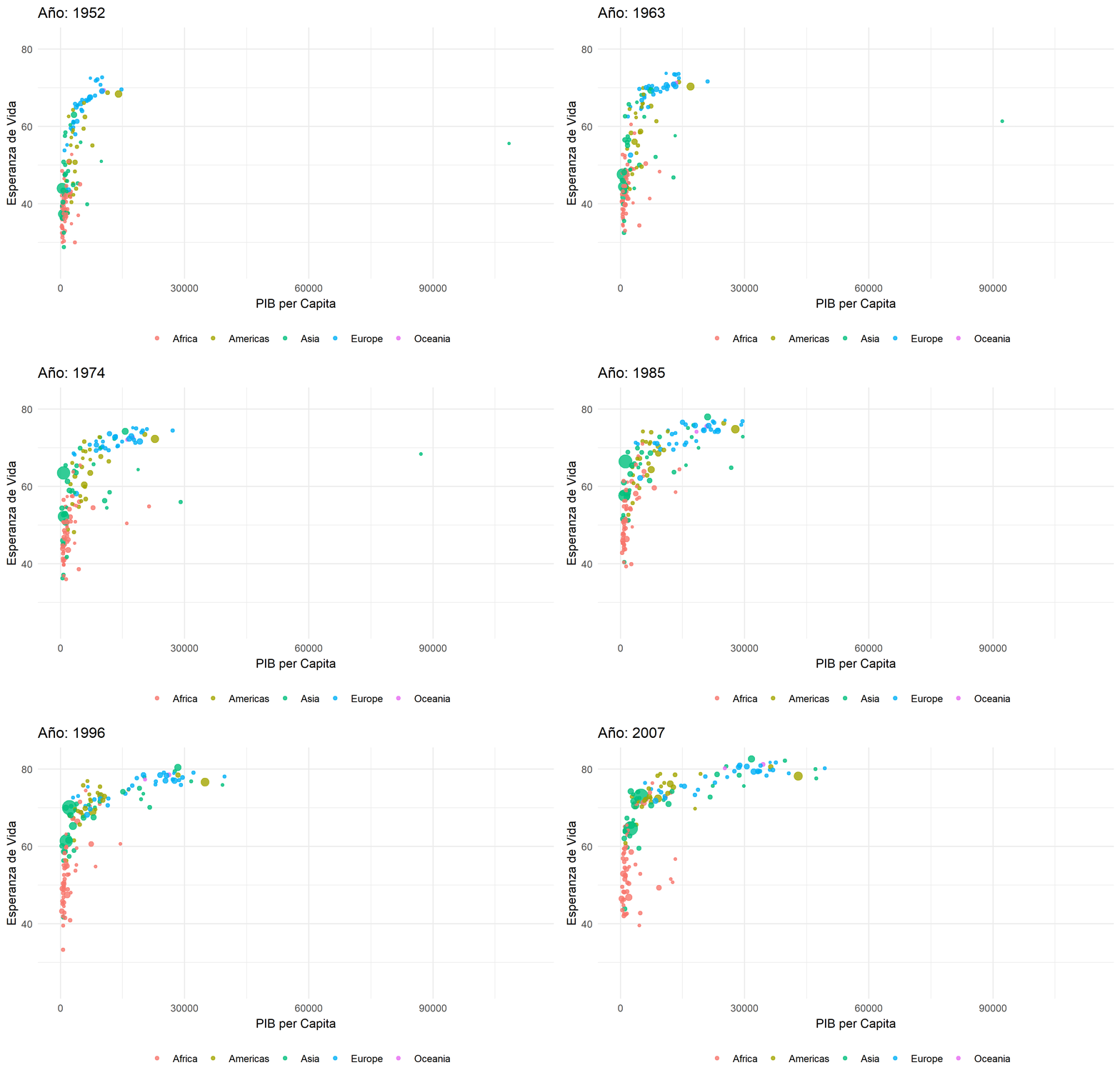<!-- --> ] --- # <i class="fa fa-diagnoses" role="presentation" aria-label="diagnoses icon"></i> Interactive Graphs .left-column[ ### Animated *gganimate()* Con las animaciones podemos generar impacto a nuestros graphs, mostrar evolución y mucho más. ] .right-column[ <!-- --> ] --- name: Dashboard class: inverse, center, middle # <i class="fa fa-tachometer-alt" role="presentation" aria-label="tachometer-alt icon"></i> # Dashboard ---- .right[ .bottom[ #### [<i class="fa fa-bell" role="presentation" aria-label="bell icon"></i>](#menu) ] ] --- # <i class="fa fa-tachometer-alt" role="presentation" aria-label="tachometer-alt icon"></i> Dashboard .left-column[ ## Shiny .center[ <img src="https://www.kindpng.com/picc/m/706-7068650_r-shiny-logo-png-transparent-png.png" width="150px"/> ] *Shiny es un paquete R que facilita la creación de aplicaciones web interactivas (aplicaciones) directamente desde R.* ] .right-column[ ### Algunos ejemplos de aplicaciones en Shiny pueden ser: * [Didactic modeling process: Linear regression for a safety issue in rural areas of Antioquia - Colombia](https://danielrivera1.shinyapps.io/Regression2/?_ga=2.187552808.1012673826.1626746491-448761589.1527204352) * [A virtual lab for teaching physiology](https://dgranjon.shinyapps.io/virtual_patient_v2/_w_6c2f29f9/) * [New Zealand Trade Intelligence Dashboard](https://gallery.shinyapps.io/nz-trade-dash/?_ga=2.192787626.1012673826.1626746491-448761589.1527204352) * [Nutrition Calculator - calculate nutrition for recipes](https://yihanw.shinyapps.io/Recipe_Nutrition/?_ga=2.219059353.1012673826.1626746491-448761589.1527204352) * [Genome browser](https://gallery.shinyapps.io/genome_browser/?_ga=2.193901613.1012673826.1626746491-448761589.1527204352) * [The ten most similar players - Pro Evolution Soccer 2019](https://thiago-valentim.shinyapps.io/project/?_ga=2.28097724.1012673826.1626746491-448761589.1527204352) ] --- # <i class="fa fa-tachometer-alt" role="presentation" aria-label="tachometer-alt icon"></i> Dashboard .left-column[ ## FlexDashboard .center[ <img src="https://rstudio.github.io/flexdashboard/reference/figures/logo.png" width="150px"/> ] *El objetivo es facilitar la creación de paneles interactivos para R, utilizando R Markdown. Diseños basados en filas y columnas flexibles y fáciles de especificar.* ] .right-column[ ### Algunos ejemplos de aplicaciones en FlexDashboard pueden ser: * [ggplotly: ggplot2 geoms](https://beta.rstudioconnect.com/jjallaire/htmlwidgets-ggplotly-geoms/htmlwidgets-ggplotly-geoms.html) * [Gene Expression Biclustering](https://jjallaire.shinyapps.io/shiny-biclust/) * [Sales Report with Highcharter](https://beta.rstudioconnect.com/jjallaire/htmlwidgets-highcharter/htmlwidgets-highcharter.html) * [HTML Widgets Showcase](https://beta.rstudioconnect.com/jjallaire/htmlwidgets-showcase-storyboard/htmlwidgets-showcase-storyboard.html) * [Waste Lands - America’s Forgotten Nuclear Legacy](https://beta.rstudioconnect.com/jjallaire/htmlwidgets-waste-sites/htmlwidgets-waste-sites.html) * [Value at Risk](https://juniorjb5.shinyapps.io/Value_at_Risk/) ] --- name: Webpage class: inverse, center, middle # <i class="fa fa-link" role="presentation" aria-label="link icon"></i> # WebPage ---- .right[ .bottom[ #### [<i class="fa fa-bell" role="presentation" aria-label="bell icon"></i>](#menu) ] ] --- # <i class="fa fa-link" role="presentation" aria-label="link icon"></i> WebPage .pull-left[ ### 📕 [Blogdown](https://bookdown.org/yihui/blogdown/) ### 🎨 [Hugo Themes](https://themes.gohugo.io/) ### ⚙️ [Netlify](https://www.netlify.com/blog/2016/09/29/a-step-by-step-guide-deploying-on-netlify/) ### 💼 [Github](https://github.com/) ### 🎮 [Demo](https://academic-demo.netlify.app/) ] .pull-right[  .center[ `How do you want the world to see you?` 🌍 ] ] --- class: center, middle # Listo... ¿Motivados? 😎 ---- -- ## ¿Opiniones?... 🗣 ¿Expectativas? 💬 --- name: Programa class: inverse # <i class="fa fa-book-open" role="presentation" aria-label="book-open icon"></i> Programa del curso ---- Saber hacer **ciencia de datos** es también saber **comunicar**. La comunicación eficaz es la piedra angular de la ciencia de datos impactante. Ya sea enseñando habilidades relacionadas con datos o informando los últimos resultados obtenidos en nuestros procesos estadísticos. .pull-left[ Nuestro trabajo con datos computacionales requiere que nuestras presentaciones e informes sean tanto reproducibles cuando necesitemos recrear el trabajo de hoy en el futuro, como también adaptables cuando los datos del mañana cambien los resultados de hoy. Este curso abarcará un mix de estilos para **#️⃣DataViz.** Aprenderemos la estructura necesaria de la data para la adecuada visualización de la información. Trabajaremos con paquetes como ggplot2, plotly, highchart, entre otros. Crearemos tableros dinámicos o dashboards. ]<!--end of left-column--> .pull-right[ .left[ ### 1. Estructura y Manipulación de la Data ### 2. Visualización estática *ggplot2* ### 3. Visualización dinámica ### 4. Dashboard ] <!--end of right-column--> ] --- class: center, middle .pull-left[ .center[ <br><br> # Gracias!!! <br><br><br><br><br> ### ¿Preguntas? ] ] .pull-right[ <img style="border-radius: 50%;" src="img/avatar.png" width="150px" /> ### [www.joaquibarandica.com](https://www.joaquibarandica.com) <i class="fab fa-twitter" role="presentation" aria-label="twitter icon"></i> jotajb5 <i class="fab fa-github" role="presentation" aria-label="github icon"></i> juniorjb5 <i class="fa fa-envelope" role="presentation" aria-label="envelope icon"></i> orlando.joaqui@correounivalle.edu.co ] <br><br><br> ---- *Las imágenes utilizadas para ambientar la presentación son de [pixabay](https://pixabay.com/).*